Article I wonder why colors need to match
I wonder why colors need to match

Colors are perceived differently from person to person, both technically and from an emotional standpoint. This is why color matching is so important.
A person's psychological reaction to color is what makes color matching in product design so important. Color is a type of art, similar to music, poetry, or dance. It should aim to please the senses and evoke emotion. By now, it is well known that particular colors are associated with specific emotions.
For example, red is said to create a sense of urgency while blue is associated with a sense of calm. Similarly, green makes people think of nature, and black presents a feeling of power. Knowing which emotion to associate with a product and choosing its color scheme in accordance is vital to that product's success.
Lastly, having a consistent color scheme throughout a product’s design makes it recognizable. For example, the red background with golden arches is iconic for McDonald's. Similarly, the distinguishable green used by Starbucks has created a legend with a single color.

User interfaces are made to fulfill the needs of a user experience. This can be achieved with very basic elements, but is often dressed up with colors and textures. The use of design colors for digital UI work is tough to understand without practice. We will look into how color can be used in UI design to dramatically affect the layout. An understanding of color psychology plays a big role, along with an overall understanding of user experience design.
If you at least have some practical knowledge of building user interfaces then this article should offer guidance for picking design colors and building a style around your layouts.
Context is Everything
Each project will have a different feel and naturally gravitate towards a different color scheme. There is rarely a single correct answer, but there are some choices that typically work better than others. Color selection is in many ways an art, and it’s often subjective based on context. So each individual project has its own goals and certain colors will fill those goals better than others.
As an example the simplicity of TechCrunch. This multi-million dollar magazine site focusing on high tech and startup companies has built an entire brand with off shades of green. This works because fancy textures and icons wouldn’t add much to the overall design. People visit TechCrunch for content so a simple recognizable branding works best.
Play with Simple Ideas
Try starting with 1-2 colors or a couple different shades of a single color. Mix these together and see what you get. Reason being that it is complicated to successfully mix multiple colors into a single design to create a color scheme. Of course, it can be done but it takes a lot of practice. When your first start to design it is better to start small rather than feel discouraged after trying too many colors at once.
When starting simple you should be looking for differences in color choices. Try to find a single color that could be dominant throughout the layout, compared with others that might work better as highlights or background colors. For example, a CTA button should stand out against all other elements within view.
The dominant color is often used in a website’s branding so you will want to take that into consideration. Ultimately try to feel out how the design should look and focus on the larger elements first. Once you choose a dominant color that you like, it becomes easier to find matching colors.
Draw Attention with Contrast
When searching for a relevant color pair try to think about contrasting effects. A very common example is black (or dark grey) and white. These two colors produce a lot of contrast which makes it easier to consume information like the text on a page.
Contrast can be used with buttons, hyperlinks, image galleries, or any type of background/foreground combination. Attention can be pushed in a certain direction with the use of contrasting colors.
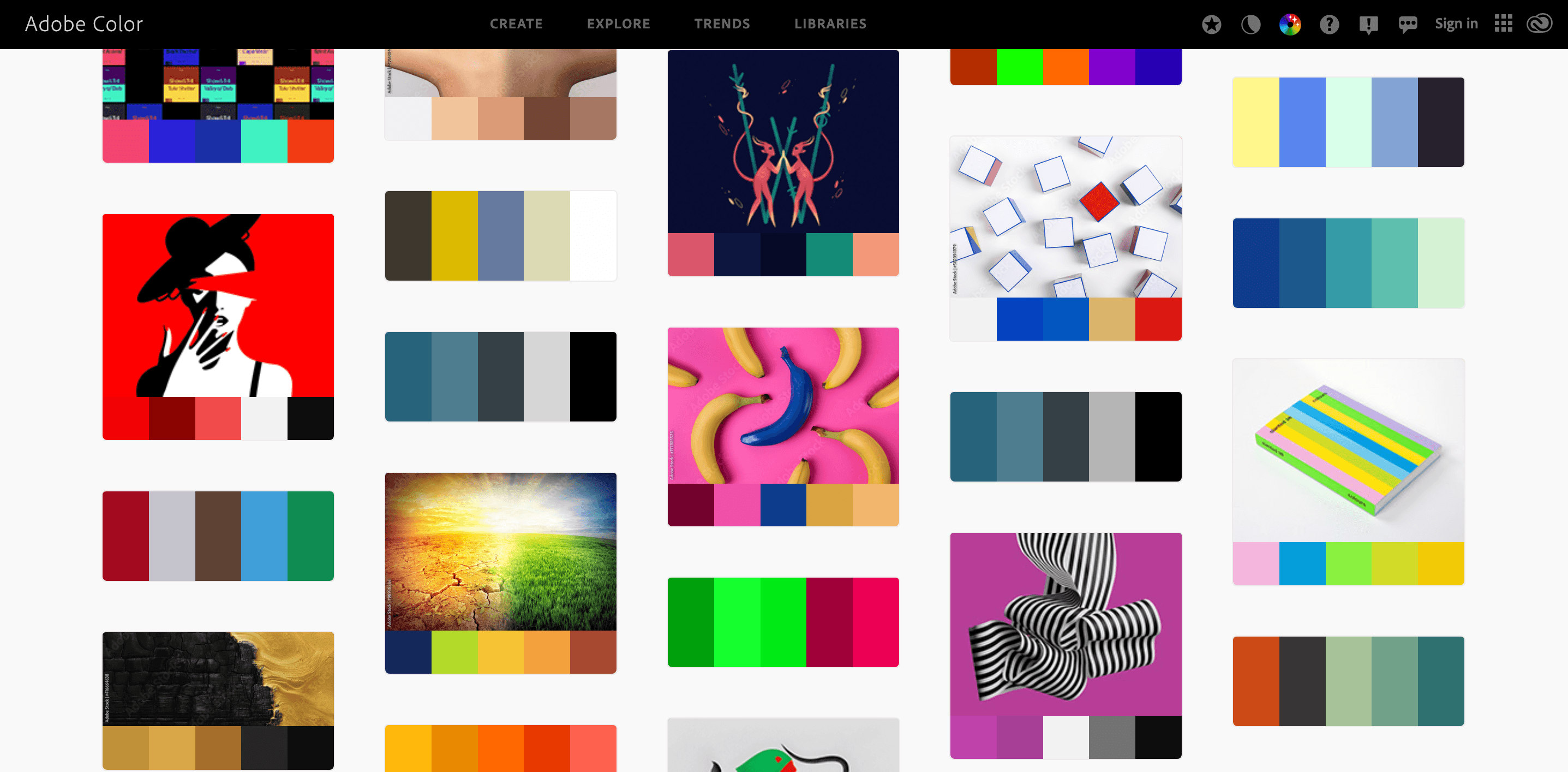
Try visiting Adobe Color’s explore page and search for “contrast”. You may be surprised how many color schemes have already been developed with high contrast in mind.
Learn to Match via Example
Spend time looking at other websites and study their layout styles. Learn from their color choices, try to think critically about why certain colors were placed together. The subject of colors in web design is long and almost unending. There really is no correct answer, only better choices within the context of a single project. So if you can find similar projects that have noteworthy color schemes you can learn by studying how they operate and what makes them feel so unique.
Coolors created by Fabrizio Bianchi - The super fast color generator!
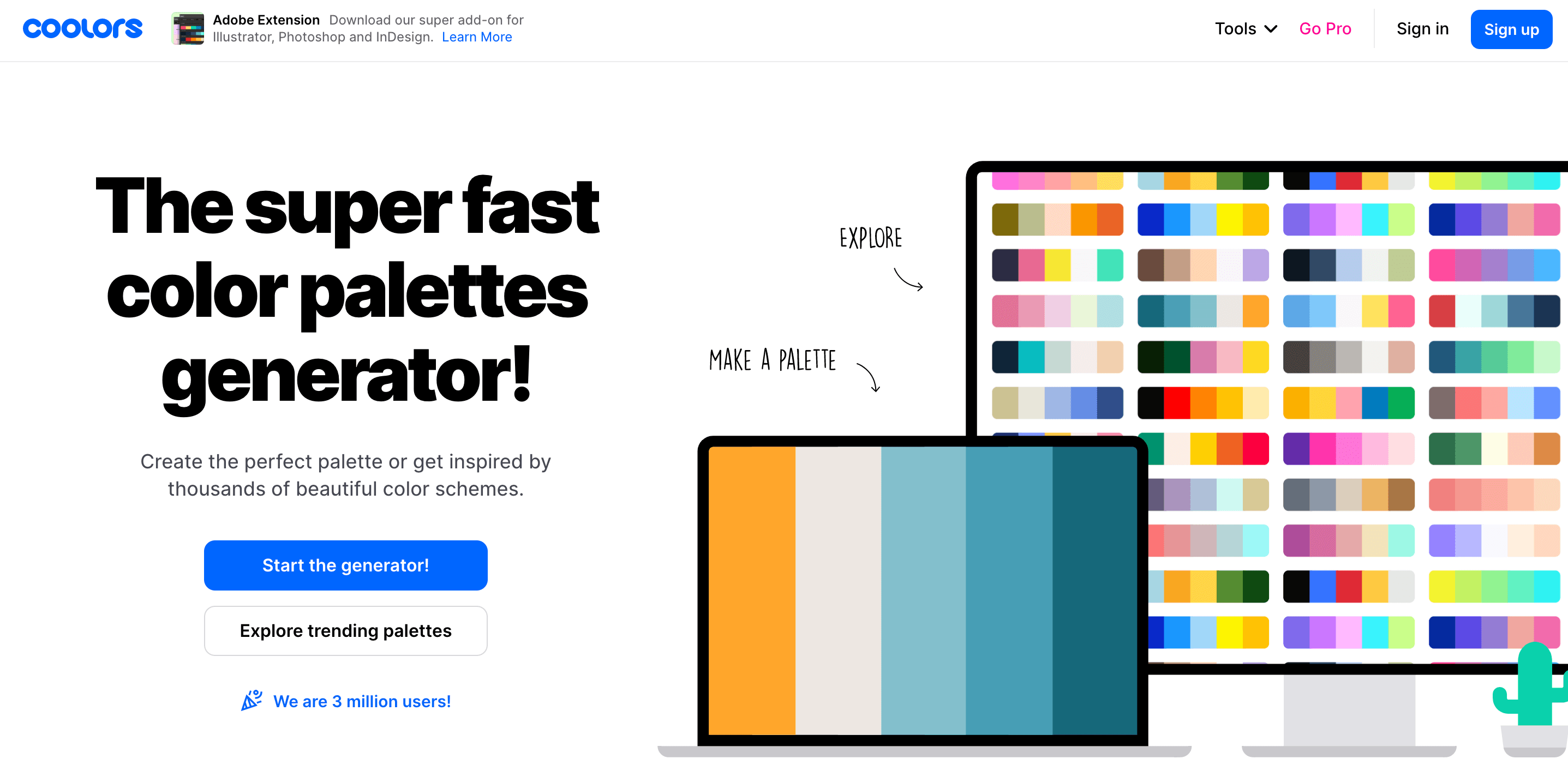
Coolors is the essential and user-friendly tool for creating and collecting color palettes. It allows you to generate perfect matching colors in seconds. We use Coolors as inspiration for our monthly color palette or a mobile app screen. When you like a specific color or two, you can lock the hex and generate other colors by simply pressing the space bar on your keyboard.
Other useful color palette tools include Paletton, Adobe Color CC, Material Palette, COLRD, Color Explorer and Tineye.
Featured Posts
Follow us on Instagram


